One backdrop per collection
Mixing white, gray and linen in one grid looks unplanned. Pick a backdrop per collection and keep it.
Jewelry Studio · Shopify
A store looks professional when every image belongs together. Turn one photo of each piece into a product page image, a matching collection tile, a wide homepage banner or a feature-section scene.
Updated · Image25 Jewelry Studio
15 credits · Fast · Medium · 1 image
Includes one reference photo. Every new generation costs 15 credits.
Email sign-in keeps your selection. Google sign-in leaves this page; reselect your photo and settings after returning.
Product page main
Light neutral backdrop, piece large and centered.
This tool makes Shopify jewelry product photos for each part of a store: a product page main image, a consistent collection tile, a 16:9 hero banner with open space for your theme's text, or a styled feature scene. Each image costs 15 credits.
01
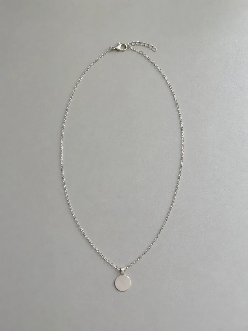
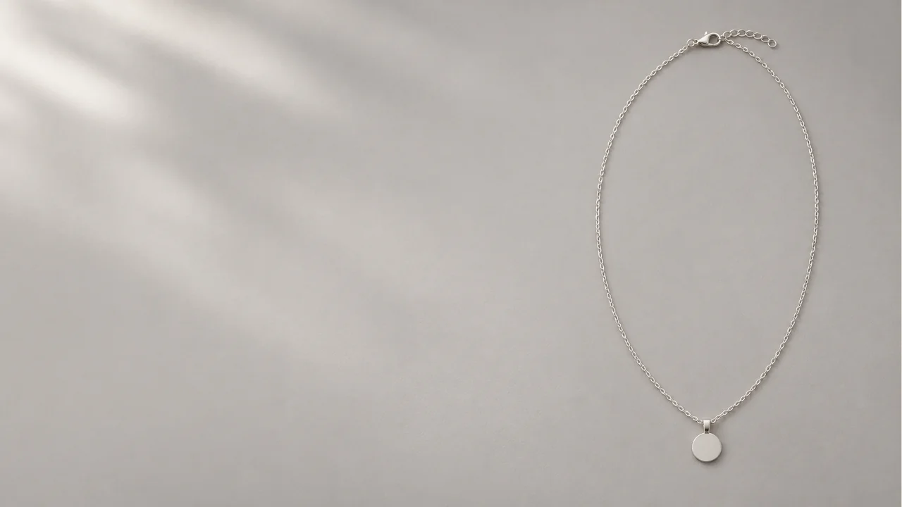
A main image, a collection tile and a wide banner from plain product photos.
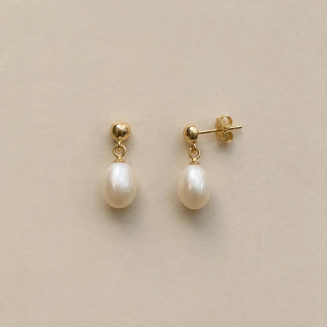 Before
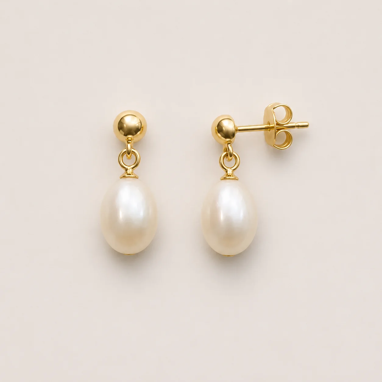 After
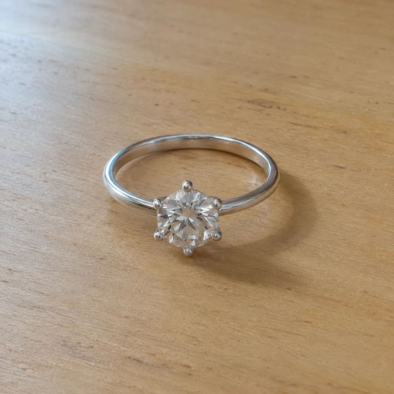 Before
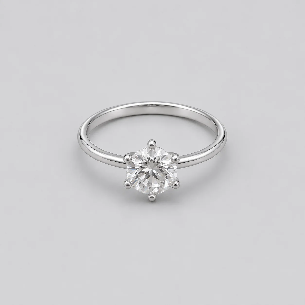 After
 Before
 After
02
Shopify does not police images the way a marketplace does. Your store is your brand, so the job is consistency: every product page, collection grid and homepage section should look like it belongs to the same shop.
Different parts of a store need different images. Product pages want a clear, centered piece. Collection grids want identical backdrops and margins so rows line up. Homepage banners want a wide frame with empty space where the theme places a headline. Feature sections want mood.
This tool produces each of those from a single photo of the piece, so you can rebuild a whole collection in one consistent style without reshooting. Your piece stays as photographed; only the backdrop, framing and light change.
Consistency also helps conversion in ways that are easy to miss. When every tile shares the same backdrop and margins, shoppers compare designs instead of photos, and a collection page reads as a curated range rather than a mix of uploads.
03
Shoot every piece in a collection with similar light and distance. Upload one PNG, JPEG or WebP up to 20 MB per piece.
Select Product page main, Collection tile, Hero banner or Feature section, plus the jewelry type. Use 1:1 for product pages and tiles, and 16:9 for banners.
Use the same store image type for every piece in a collection so the grid stays consistent. Compare each piece with your photo before uploading it to Shopify.
04
Square images are the safe default for products; wide images suit banners.
| Store image | Format here | Where it goes | Tip |
|---|---|---|---|
| Product page main | 1:1 | First image on the product page | Keep the same margins for every piece |
| Collection tile | 1:1 | Collection and search grids | Use one backdrop for the whole collection |
| Hero banner | 16:9 | Homepage or collection header | Leave the left side clear for theme text |
| Feature section | 4:3 | Image-with-text and story blocks | Pair with a short line about the piece |
05
Consistency is what makes a small shop look established.
Mixing white, gray and linen in one grid looks unplanned. Pick a backdrop per collection and keep it.
Pieces should sit at the same size and position across tiles. The Collection tile option centers each piece with even margins.
Shopify commonly recommends square product images around 2048 × 2048 px for a sharp zoom. The default Fast setting produces about 1K images, so upscale or choose a higher-quality setting for zoom-heavy themes.
Describe material, stone and setting in each image’s alt text in Shopify admin. It helps accessibility and image search.
Rename downloads to describe the piece, for example gold-pearl-drop-earrings.webp, before uploading. Descriptive file names help image search.
06
07
Check the piece, then the fit with your theme.
| Check | Good result | Reject if |
|---|---|---|
| Piece | Same stones, metal and shape | Any detail redesigned |
| Consistency | Backdrop and margins match the collection | The tile looks different from its neighbors |
| Banner space | Clear area where theme text sits | The piece sits under the headline |
| Sharpness | Detail holds up at zoom size | Soft or noisy when enlarged |
| Text | No text in the image | Words or logos were added |
| Mobile view | The piece reads clearly at phone width | The piece is too small to see in a phone grid |
08
Build a consistent catalog without booking a studio.
Example: twenty pieces as matching collection tiles.
A new theme often needs new banner and feature images.
Example: a 16:9 hero banner for the homepage.
Match new pieces to the look of existing ones.
Example: a new earring drop on the same soft-gray tile.
Swap the hero banner for each campaign.
Example: a pendant banner for a holiday edit.
A consistent catalog doubles as wholesale material.
Example: collection tiles reused in a line sheet PDF.
09
A practical order for refreshing a whole Shopify store.
Choose one backdrop and framing for product pages and one for collection tiles before you generate anything.
Rebuild the products that get the most traffic, then work through the rest of each collection.
Once products match, create homepage and collection banners that use the same palette.
Write down the store image type and format you used so new products added later match.
Most shoppers browse on phones. Preview collection grids and banners at phone width before publishing, and make sure the piece still reads at that size.
Before you publish
AI may alter small stones, prongs, chains or metal tone. Compare every result with your photo and reject anything that changes the piece.
Image size guidance here reflects common recommendations, not an official Shopify requirement; your theme’s documentation is the final word. Shopify is a trademark of its owner; Image 25 is not affiliated with Shopify.
References
Checked on . Platform rules change; confirm the current policy before you rely on it.
Official guidance on product images, supported formats and recommended sizes.
Questions
Square images are the common default for product pages and collection grids, and around 2048 × 2048 px is a widely cited recommendation for sharp zoom. Check your theme’s documentation, because themes crop and display images differently.
Photograph every piece in similar light, then use the same Collection tile setting for all of them. The tool centers each piece on the same soft-gray backdrop with even margins.
Yes. Choose Hero banner in 16:9. The piece sits in the right third with clear space on the left, where most themes place a headline and button.
Usually not. Keep text in your theme’s banner settings so it stays sharp, editable and readable by search engines. The tool does not add text to images.
Your store is your own, but every image should accurately represent what you sell. Compare each result with the real piece and keep at least one plain, accurate image per product.
Commonly four to six: a main image, one or two angles or details, a styled or lifestyle image and a real scale photo. Use the same main-image style across every product so collection pages stay consistent.
Each image costs 15 credits on the default Fast setting, including your reference photo. New accounts that use Google sign-in or a Gmail address get 20 free credits, enough for one image. Free-credit images carry a watermark and are for personal use; use paid credits for store and marketplace images.
Your upload is private and scheduled for deletion after one day. On a free account, generated images stay in My Creations for 14 days; paid plans and credit packs keep them longer.
Upload a photo of each piece, pick one store image type for the collection and check every result before uploading.
Upload a jewelry photo