Stones change with the metal
Colorless stones can pick up warmth from yellow or rose gold reflections. Compare stone color with the original and regenerate if it shifts.
Guide · Edit & variations
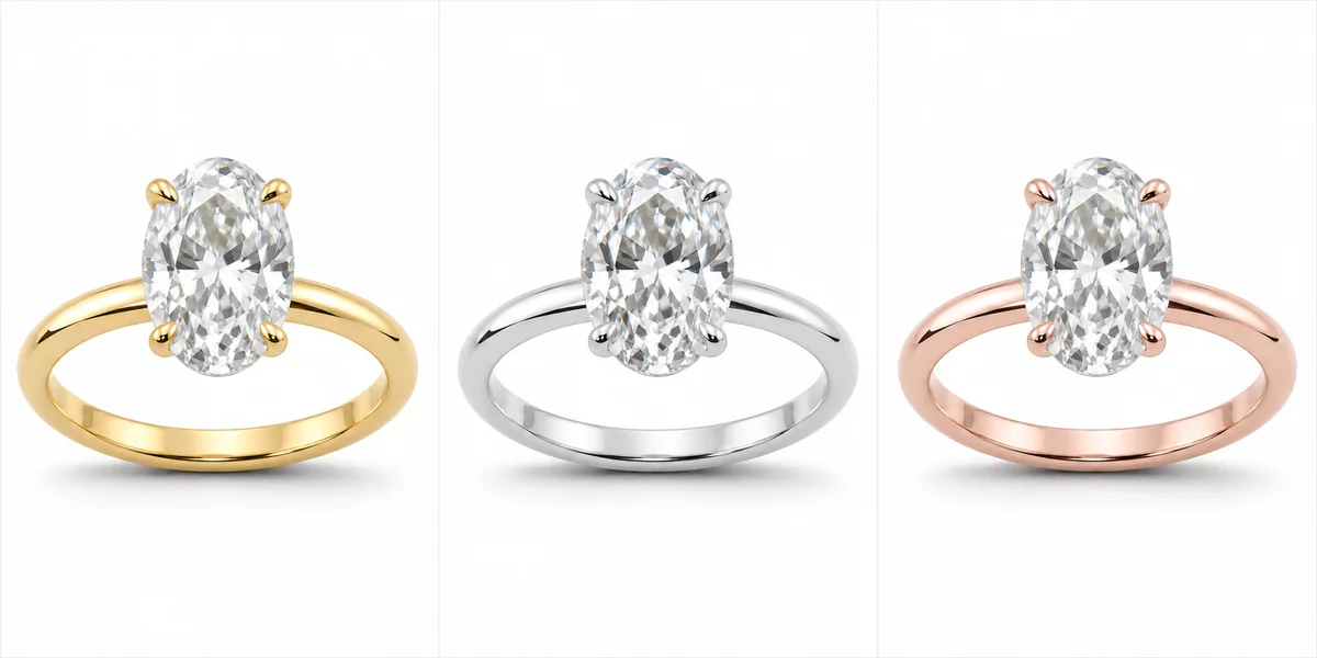
The same ring can feel classic in yellow gold, crisp in white gold and romantic in rose gold. A jewelry metal color preview lets you see all three before anything is cast, as long as you compare fairly and label the results honestly.
Published · Updated · Image25 Jewelry Studio
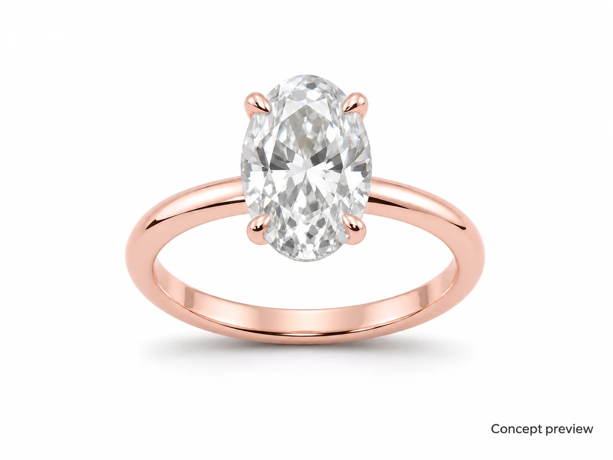
Open the metal color changerTo preview one design in yellow, white and rose gold, start from one clean image of the design, generate one metal color preview per gold from that same image, compare them side by side, and label every result as a concept. Metal type, karat and plating are facts from your supplier, never from the image.
01
Pure gold is soft and deep yellow, so jewelry is made from gold alloys: gold mixed with other metals. The other metals change both the hardness and the color, which is why the same karat can come in different colors.
Yellow gold keeps the warm color of gold, balanced with silver and copper. Rose gold adds more copper, which pulls the color toward pink or red; the more copper, the redder it looks. White gold mixes gold with white metals such as palladium or nickel, and the result is often an off-white that is plated with rhodium to look bright white. That plating can wear and may need renewing.
These differences explain what a preview can and cannot show. A preview can show the look of each color on your design. It cannot show the alloy, the karat, whether a white gold piece is plated, or how the color will age.
02
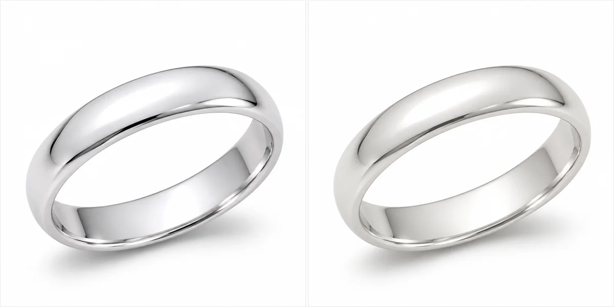
Reference images for a fair metal comparison.
03
Four steps keep the comparison honest.
Use a render or a studio photo with the whole piece in frame, soft light and a neutral background. Strong colored reflections can tint the new metal, so avoid them.
Make yellow, white and rose gold previews from the identical source. If each preview starts from a different photo, framing and light will differ and the comparison will mislead.
Compare each preview with the original: stones, prongs, engraving, texture, shape and background should be identical. Regenerate any preview where something else changed.
Place the three previews in one row at the same size. Decide on the look, then confirm the real alloy, karat and finish with your supplier.
04
General tendencies, not rules. Your design and customers decide.
| Choice | Yellow gold | White gold | Rose gold |
|---|---|---|---|
| Overall feel | Classic, warm | Crisp, modern | Soft, romantic |
| Colorless stones | Warm contrast around the stone | Stone looks whitest | Gentle, vintage contrast |
| Colored stones | Rich with greens and reds | Cool with blues | Warm with pinks and peaches |
| Maintenance note | Color is through the alloy | Plating may need renewing | Color is through the alloy |
| Preview check | Not orange or brassy | Not gray or flat | Not copper-brown |
05
Where previews go wrong, and how to spot it.
Colorless stones can pick up warmth from yellow or rose gold reflections. Compare stone color with the original and regenerate if it shifts.
Brushed and hammered finishes can turn shiny. Name the finish in the notes and check it.
White gold prongs on a yellow gold ring are a common design. Name the part to keep, or expect it to change.
Screens vary. Judge previews on one screen at a time and confirm the real color with a metal sample.
06
A preview is a concept; say so where it matters.
If a listing shows a metal you make to order, caption the preview as a concept or state “shown as a preview” in the description.
State the alloy, karat and any plating in text, using the terms your materials support. In the United States the FTC’s jewelry guides explain how gold and plating terms should be qualified.
A color preview cannot show karat. Do not add karat or purity claims that come only from an image.
Once a metal option is made, replace the preview with a real photo of that piece.
07
08
Confirm these facts before you sell a metal option.
Not every color is available in every karat, and alloys differ between suppliers.
Ask whether white gold is rhodium-plated and how often customers should expect replating.
Before you publish
A metal color preview helps you and your customers choose a look. The metal itself, its karat, alloy and plating, comes from your materials and is stated in words.
Keep previews labeled, keep materials accurate, and photograph each option once it exists.
References
Checked on . Platform rules change; confirm the current policy before you rely on it.
Overview of gold alloys: copper content in rose gold, white metals in white gold and rhodium plating.
Primary US text on how gold, karat and plating terms should be used and qualified.
The FTC notice that published the current version of the guides.
Questions
Upload one clean image of the design to the metal color changer, choose a metal and generate. Repeat from the same image for each metal you want to compare, then place the previews side by side.
Rose gold is a gold alloy with more copper. The more copper in the alloy, the pinker or redder the color.
White gold alloys are often off-white and plated with rhodium for a bright white finish. As the plating wears, the warmer alloy can show through. A preview shows the bright finish, not the alloy underneath.
No. Karat and alloy are facts about the material. State them in words from your supplier’s information, never from an image.
Label them whenever a listing shows a metal you have not photographed, for example a made-to-order option. It sets accurate expectations and avoids presenting a concept as stock.
Preview all three from the same image, then decide with your customers in mind. Many makers launch in one gold and offer the others to order.
Upload one clean design image, preview it in each gold, and label the results as concepts.
Open the metal color changer